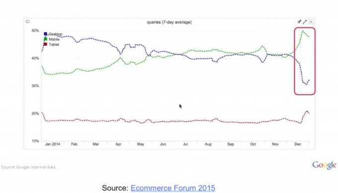
April 21st was the 1st day that Google made a major algorithm shift. This is no surprise as Google has been pretty lenient in making major updates to their algorithm recently. There was no doubt that the teams were working on something big. However this major update was no surprise as we could see it coming all along. Ever since mobile browsing surpassed the desktop dinosaurs in Dec, 2014 this change was expected.
What is “Mobilegeddon” ?
Google made an announcement at the end of February that they are expanding their use of mobile-friendliness as a factor when it comes to ranking search engine results. They made it known that it will have a major impact on website rankings based on how they deliver their experience on mobile devices.
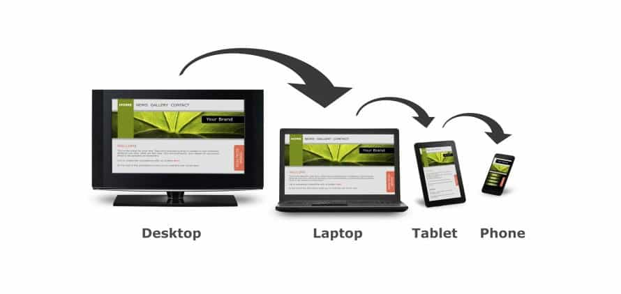
In short, it means that you must have a mobile website or ideally a responsive website. (Learn more about responsive website design)
Why should you care?
The world is already mobile, and if your company is not ready, you are going to be left behind.
Here are some facts to consider:
- About 60 percent of Internet access is through a mobile device, not a desktop or laptop. That number keeps growing every year.
- Over 60 percent of North American Google searches come through mobile devices.
- Mobile commerce is becoming more prevalent as a majority of users are now using their mobile devices for shopping online.
- 2 Billion people are going to use their smart phones as their dominant device to browse the web by the end of 2015. The international market is exploding and much of that growth is mobile.
- Take care of your audience online and save them the hassle of pinching in and out. A better experience will bring in devoted users that keep coming back.

How to test for a responsive website?
You can always access the website on your mobile device and see if you need to zoom in or not. If the content does not adapt and you need to zoom in to view the information, chances are that the website is not responsive.
A couple of years ago 2 Web Design developed a nifty tool called: IsMySiteResponsive.com – Check out this tool and enter in a website address to see how it would potentially look in different resolutions of smartphones and tablets.
Finally, have Google test your website. Use their Mobile-Friendly Test tool to see if your website qualifies for their update.
We are here to help
If you need advice on how you can be better prepared for this major Google update, give us a call or contact our team to do a complimentary analysis of your website and provide you with ideas that you can implement to deliver the best user experience for your audience.